1. Introduction
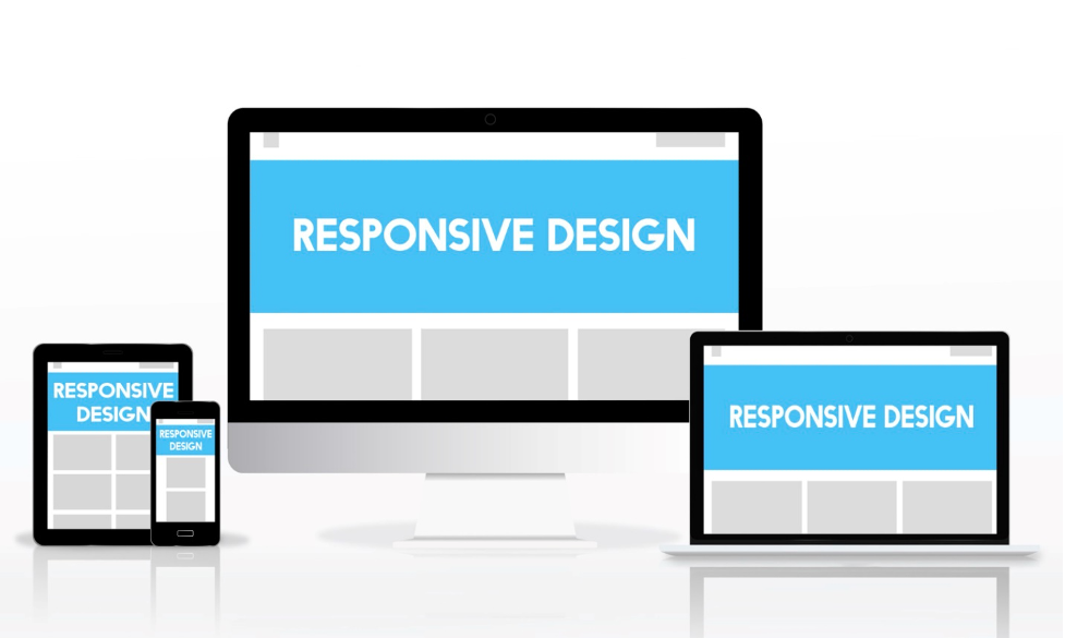
We would like to begin with what responsive design is. Responsive web design is a design that approach focuses on building websites that can adapt to different screen sizes and devices. A website’s content may be resized and rearranged using responsive design to match the screen size of any device, by providing the viewer with the best viewing experience possible. By using the latest website design concepts and methods, we’ll demonstrate how to create a responsive website that works on any device.
2. Understanding responsive web design
Responsive web design is based on three key principles: fluid grids, flexible images, and media queries. Fluid grids use relative units of measurement, such as percentages, rather than fixed pixel widths. This allows the website to adapt to different screen sizes, maintaining its proportions and layout. Flexible images use max-width properties to ensure that images can scale down proportionally to fit smaller screens, without becoming pixelated or distorted. Finally, media queries are used to apply different stylesheets to different screen sizes, ensuring that the website looks and functions optimally on any device.
3. Why is responsive design important?
Responsive design is crucial since your website must be accessible and visible on all devices. Make sure your website appears and works properly on smaller screens as more and more people access the internet using mobile devices. Responsive web design also helps to improve your website’s search engine result page rankings (SEPR), as Google prioritizes mobile-friendly websites in search results.
4. Key principles of responsive design
To build a responsive website, you need to understand and implement the following key principles of responsive design:
- Fluid grids
Fluid grids use relative units of measurement, such as percentages, to size elements on a web page. This allows the layout to adapt to different screen sizes, without losing its proportions or structure. You can make sure that your website looks great and works well on every device, regardless of the screen size, by using fluid grids.
- Flexible images
Flexible images are images that can scale down proportionally to fit smaller screens, without becoming pixelated or distorted. To make your images flexible, you should use max-width properties in your CSS. This ensures that your images will never exceed the width of their container, and will always maintain their aspect ratio.
5. Steps to building a responsive website
A responsive website has to be developed using both design and development expertise. These are the steps that you need to follow to create a responsive website that will work on any device:
Step 1: Plan your design and layout
You must plan your website’s design and layout before you begin development. This involves creating wireframes and mockups that show how your website will look on different screen sizes. Analyze the structure of the content which you want to show on your website.
Step 2: Use a responsive framework
Easy methods for creating responsive websites are you can use a responsive framework like Bootstrap or Foundation. These frameworks provide pre-designed components and layouts that help you to use them as a starting point for your website. furthermore, they also contain responsive CSS classes that can be used to make sure that your website looks good and work properly on all devices.
Step 3: Write responsive CSS
You must create CSS for your website that can adjust to multiple screen sizes if you want it to be responsive. This involves using media queries to apply different styles to different screen sizes. You should also use relative units of measurement, such as percentages or ems, to size elements on your website.
Step 4: Test your website on different devices
To make sure it works and looks well across all devices, test your responsive website after it has been built. This involves using tools like Browser Stack or Cross Browser Testing to test your website on different browsers and devices.

6. Best practices for responsive web design
To ensure that your website is fast, user-friendly, and accessible, you should follow these best practices for responsive web design:
- Optimize images for faster loading times
Image optimization is necessary to make sure that your website runs swiftly on all devices. You can compress your images by using the correct file format, such as JPEG or PNG.
- Minimize HTTP requests
Your website should make the minimum number of HTTP queries in order to load faster. This involves combining CSS and JavaScript files, using image sprites, and using browser caching.
- Use modern CSS techniques
To make your website look fantastic and work well, you should use the latest CSS techniques like flexbox and grid. These techniques allow you to create complex layouts and responsive designs without relying on tables or floats.
- Use responsive typography
Use responsive typography to make sure that all devices can read your website easily. This involves using relative font sizes and line heights, as well as adjusting the typography for different screen sizes.

7. Common mistakes to avoid
There are several mistakes that are frequently made while creating responsive websites that you should avoid. These include:
- Not testing on all devices
To ensure that your website appears and operates properly on all devices, you should test it on as many as devices you can. Tablets, laptops, desktops, and cell phones are all included in this.
- Overcomplicating the design
Your website should have a straightforward and clear design to make it simple to explore. Avoid using too many graphics, animations, or complex layouts.
- Not optimizing for speed
To ensure that your website loads quickly, you should optimize your website for better speed. This involves using compressed images, minified CSS and JavaScript files, and reducing HTTP requests.
- Ignoring accessibility
To ensure that your website is accessible to all users, you should follow accessibility. This involves using alt tags for images, providing text descriptions for videos, and using clear and concise language.
8. Optimize Images
Images play a significant role in web design. They add visual appeal and enhance the user experience. However, large images can slow down your website’s loading time. To prevent this, it’s essential to optimize your images by compressing them without compromising their quality. This can be done using various image compression tools available online.
9. Test Your Website
It’s important to test your website on many devices before publishing it to make sure it is functioning and responsive. To test whether your website is mobile-friendly or not, you can use free tools like Google’s Mobile-Friendly Test. It’s also essential to test your website’s speed using tools like Google Page Speed Insights.
10. Keep Your Website Updated
Finally, it’s crucial to keep your website updated with fresh content, security updates, and other essential maintenance tasks. Regularly update your website by adding more content and design to keep it relevant and engage more audiences. Furthermore, make sure that you have installed updates and patches for any software or plugins you’re using to ensure that your website is safe and secure.
Conclusion
Although creating a responsive website that functions on any device may seem difficult, it is an essential component of any successful online presence. You can build a website that not only looks wonderful but also provides a fantastic user experience on all devices by following these guidelines and best practices. Remember to optimize your images, test your website, make it search engine friendly, create quality content, use CTAs, integrate social media, monitor your website’s performance, and keep it updated regularly.